


FlightGlobal is the global aviation community’s primary source of news, data, insight, knowledge and expertise. We provide news, data, analytics and advisory services to connect the aviation community globally and help organisations shape their business strategies, identify new opportunities and make better decisions faster.
Brussels Airlines unveils new ‘diversity’ livery for post-crisis recovery
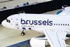
Lufthansa Group carrier Brussels Airlines has unveiled a new colour scheme and logo as it embarks on the post-crisis recovery track.
Keep reading this article by becoming a FlightGlobal member now
PLEASE REGISTER FOR FREE OR SIGN IN TO CONTINUE READING
You have reached your limit of free articles for this period. Register for a FREE account to read this article and benefit from:
- Increased access to online news and in-depth articles from:
- FlightGlobal Premium covering the global aviation industry
- Airline Business providing insight for business leaders
- Weekly newsletters on topics across the industry