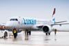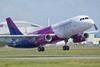


Scandinavian budget carrier Norwegian is to start rolling out a refreshed version of its corporate logo, for the first time since the airline emerged more than two decades ago.
Norwegian says the new visual identity has a “richer” colour and updated typography.
It says it will begin adopting the updated logo from March, initially on its digital channels, before broadening it to airports, offices, and its aircraft fleet.
The airline uses Boeing 737s including the Max version.
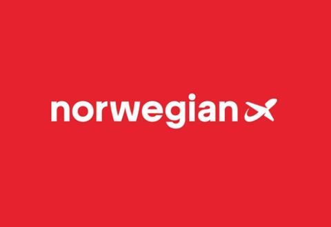
While the carrier’s logo and brand are “very well known”, says Norwegian executive vice-president for market and customer service Christoffer Sundby, a “modernisation is in order” given that it has remained unchanged since 2002.
Norwegian says there is a need to align the visual scheme to current marketing requirements, as well as show the company’s “brand personality” more clearly.